26 Best Interior Color Palette Ideas to Transform Your Home

Choosing the right color palette for your home is like selecting the perfect outfit.
It has the power to express your personality, set the tone, and even influence your mood.
Whether you want a space that feels calm and serene, bold and energetic, or warm and inviting, the right colors can make all the difference.
This guide dives into the 26 best interior color palette ideas, offering you inspiration, tips, and practical advice to help you pick a color scheme that works for your unique style and home environment.
1. Soft Neutrals with Earthy Accents

Soft neutrals like cream, beige, and taupe are timeless and versatile.
Paired with earthy accents like warm terracotta or olive green, this palette brings a sense of calm and balance into your home.
It works well in living rooms, bedrooms, and kitchens, providing a neutral backdrop that allows other elements—like furniture, textures, and artwork—to shine.
Pro Tip: Use neutral tones on walls and larger furniture pieces while incorporating earthy hues in throw pillows, rugs, and curtains for a pop of color.
This combination creates a sense of warmth and welcomes guests with open arms.
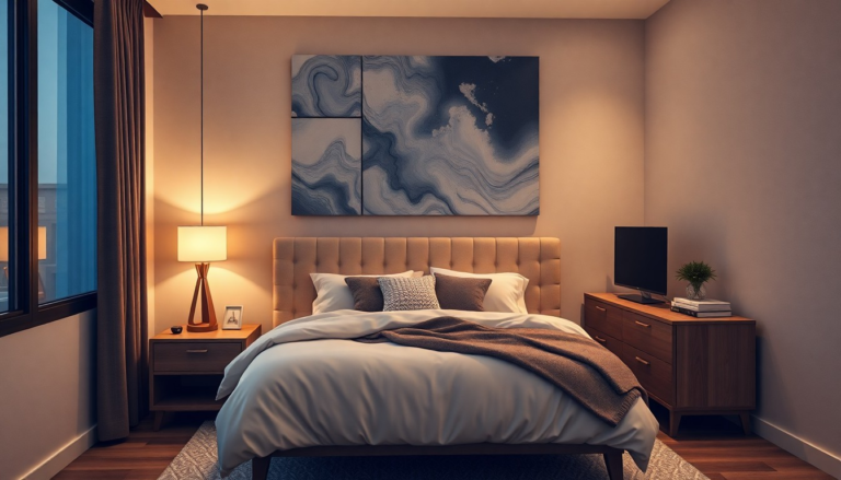
2. Moody Blues and Grays

If you’re aiming for a cozy, sophisticated vibe, moody blues and grays can do wonders. Think deep navy, charcoal, and slate gray.
These hues create a relaxing, intimate atmosphere that works especially well in bedrooms and living rooms.
It’s perfect for those who want to keep things calm yet intriguing.
Personal Insight: I once painted my bedroom in a rich navy blue, paired with gray accents.
The result? A space that felt like a sanctuary, calm and peaceful yet full of personality.
If you’re aiming to add a touch of elegance and drama, this palette is a must-try.
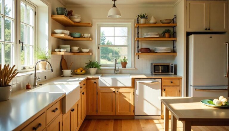
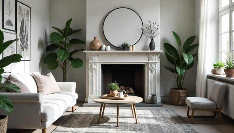
3. Warm Whites and Off-Whites

White is often thought of as stark and sterile, but warm whites and off-whites can create a soft, inviting space.
These shades have subtle undertones of cream, beige, or light gray, making them feel much warmer and more welcoming than a pure white.
Pro Tip: Pair warm whites with natural materials like wood and woven textures.
The contrast between the cool tones of the white and the natural warmth of wood creates a visually pleasing balance.
This palette is perfect for minimalistic, Scandinavian, or even farmhouse-inspired interiors.
4. Bold Reds and Pinks
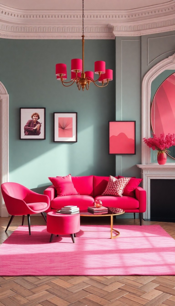
If you’re looking to energize your space, a pop of bold reds and pinks might be exactly what you need.
These colors bring passion and warmth into a room.
From deep crimson to soft blush, red and pink can elevate the energy of any space, whether it’s a dining room, living room, or even a home office.
Fun Fact: Did you know that red is said to stimulate conversation and appetite? It’s no surprise that it’s commonly found in dining rooms and kitchens.
However, when used sparingly and paired with neutrals or earthy tones, it can also create a stylish, modern vibe.
5. Fresh Greens with Light Neutrals
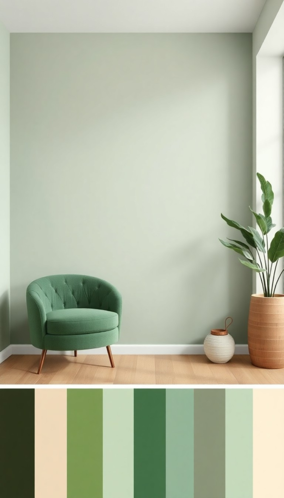
There’s something inherently refreshing about green—it brings the feeling of nature indoors.
Paired with light neutrals like white, beige, or soft grays, green can create a soothing yet invigorating environment.
This palette works beautifully in kitchens, bathrooms, and living areas, where you want to feel both refreshed and at ease.
Personal Anecdote: After I added a mint green accent wall in my living room, the space felt lighter, fresher, and much more inviting.
I paired it with light gray furniture and soft white decor, and it instantly became one of my favorite spots in the house.
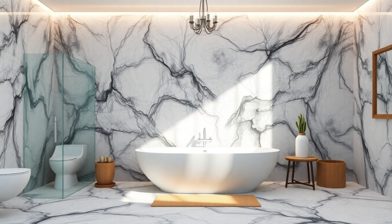
6. Calming Blues and Greens

The combination of blue and green evokes a sense of tranquility—perfect for creating spaces where relaxation is the priority.
Imagine the calming shades of the ocean or a serene forest landscape.
Pair a soft seafoam green with sky blue, and you’ll have a space that feels effortlessly peaceful.
Pro Tip: This palette works especially well in bedrooms and bathrooms, where a peaceful, spa-like atmosphere is needed.
Add in soft textures like fluffy towels or linen cushions, and you’ll feel like you’re on vacation every time you step inside.
7. Warm Terracotta and Natural Tones

Warm, earthy terracotta paired with natural tones creates a space that feels both grounded and vibrant.
The rustic charm of terracotta brings in a sense of history and warmth, while natural tones like beige, taupe, and wood accents keep things neutral and balanced.
Personal Insight: I’ve used this palette in my kitchen with terracotta floor tiles and neutral cabinets.
The rich, earthy feel makes the space feel cozy and lived-in while also exuding a modern, earthy vibe.
If you want a natural, boho-chic look, this is the palette for you.
8. Classic Black and White
Black and white—the ultimate classic combination. If you’re looking for timeless elegance with a touch of drama, this color pairing can’t be beaten.
Whether it’s used in furniture, walls, or accessories, black and white can elevate the design of any space, making it feel sharp, stylish, and sophisticated.
Pro Tip: To keep it from feeling too stark, add natural wood accents or soft metallic details like gold or brass.
This small addition will bring balance to the high contrast of black and white, creating a space that feels more inviting.
9. Soft Pastels for a Playful Vibe

Pastel shades like lavender, peach, baby blue, and mint green offer a playful and light-hearted energy.
These soft hues are perfect for nurseries, kids’ rooms, or spring-inspired living areas.
They exude warmth and whimsy, making any space feel like a joyful retreat.
Fun Fact: Pastels are known for their calming and comforting qualities, making them ideal for spaces where you want to relax or unwind.
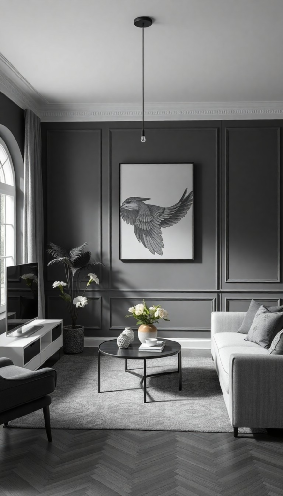
10. Dark Charcoal and Metallic Accents
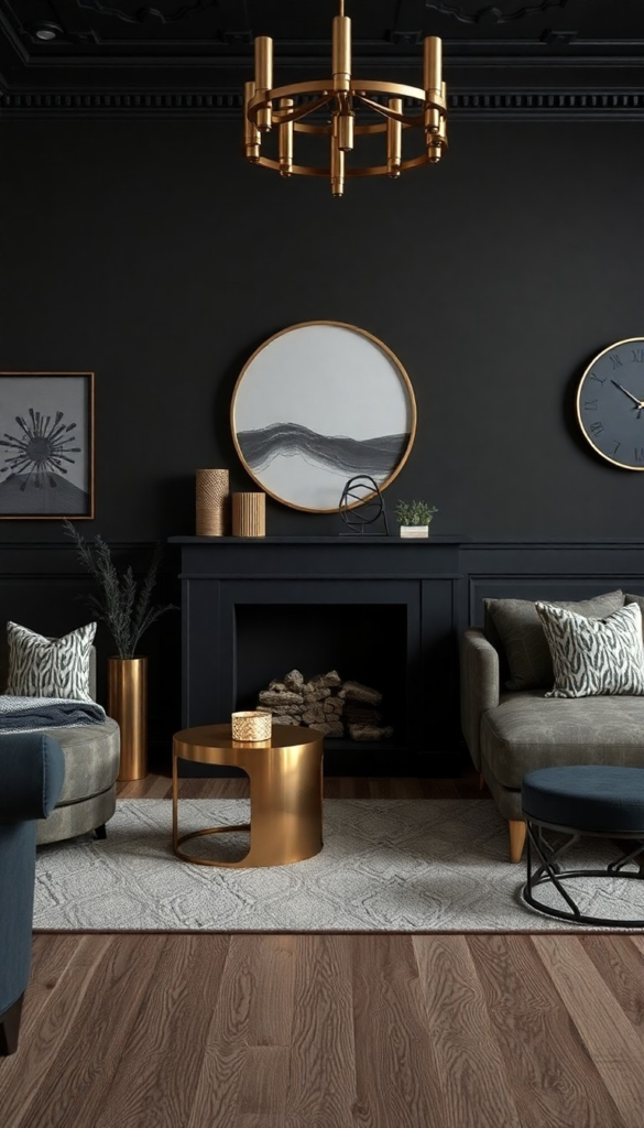
For a more luxurious, dramatic look, consider pairing dark charcoal or graphite gray with metallic accents like gold, silver, or copper.
This palette exudes sophistication and glam, making it perfect for living rooms or formal dining rooms.
Pro Tip: If you’re hesitant about going too dark, balance the deep tones with lighter furniture pieces or light fixtures.
The contrast creates depth and interest without overwhelming the space.
11. Soft Lavender and Gray
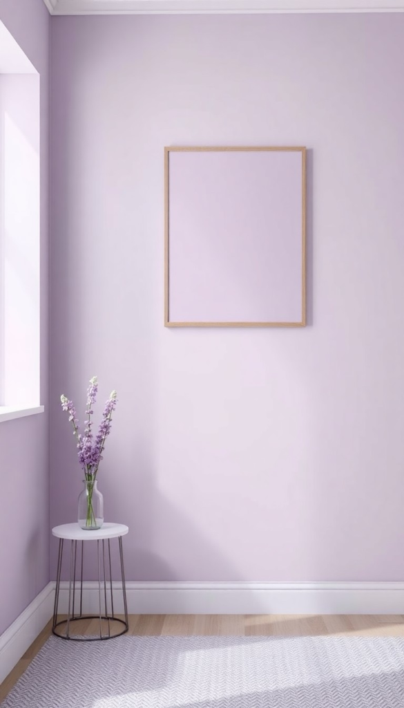
If you love the idea of a calming, serene bedroom, this soft palette will make it happen.
Pairing lavender with gray creates a subtle, sophisticated combination that feels both relaxing and refined.
This works especially well in bedrooms or home offices, creating a peaceful retreat that still feels elegant.
Personal Insight: I’ve had lavender walls with light gray furniture for a few years now, and it’s the perfect mix of cozy and fresh.
The color combo promotes relaxation, and I’ve found it to be a great choice for a good night’s sleep.
12. Sunny Yellow and Crisp White
Yellow brings a burst of sunshine to any room.
Paired with crisp white, this combo adds a cheerful vibe that’s perfect for spaces that need a little pick-me-up.
Whether it’s the living room or a sunroom, this palette will make your space feel like it’s always spring.
Fun Fact: Yellow is known to stimulate creativity, making it ideal for home offices, kitchens, or any room where you want to encourage a positive, vibrant atmosphere.
13. Rustic Brown and Cream
Rustic brown paired with cream is a grounded, natural combination perfect for creating a warm and inviting home.
Whether in the form of wood accents, leather furniture, or cream-colored walls, this palette evokes a sense of comfort and relaxation.
Pro Tip: This color palette works well with natural textures like wool throws or woven baskets, adding depth and character to the space.
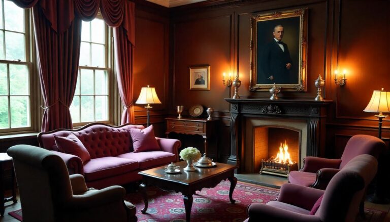
14. Deep Burgundy and Gold
For those who love rich, opulent vibes, pairing burgundy with gold creates an environment of luxury and elegance.
Perfect for formal dining rooms, living rooms, or entryways, this combination will instantly make your space feel like a million bucks.
Personal Insight: I’ve used burgundy cushions on a neutral sofa with gold-framed mirrors, and it makes the entire room feel rich, dramatic, and timeless.
15. Cream and Teal
Pairing cream with teal adds a touch of refreshing vibrancy while maintaining a soft, neutral base.
The teal injects an energetic, ocean-inspired vibe into the space, while the cream tones balance it out and keep things from feeling too bold.
Fun Fact: Teal is a great color for promoting relaxation, making it ideal for bedrooms or living areas.
16. Soft Peach and Coral
Peach and coral create a warm, inviting atmosphere that feels bright without being overwhelming.
These shades work wonderfully in living rooms or dining rooms, providing a cheerful yet sophisticated space.
17. Greige and Gold
Greige—a perfect blend of gray and beige—paired with gold accents creates a soft, sophisticated, and luxurious feel.
This palette works wonderfully in modern and transitional styles, offering a mix of neutrality and elegance that’s easy to live with.
18. Vibrant Orange and Deep Blue
For a bold and striking combo, vibrant orange paired with deep blue creates a high-contrast look that’s full of energy.
This combo is perfect for living rooms and home offices, making it ideal for those who love to experiment with bold design.
19. Warm Beige and Ivory
A combination of beige and ivory evokes a sense of calm sophistication.
The warm tones in beige provide an inviting atmosphere, while the ivory keeps the space light and airy.
This works beautifully in living rooms or bedrooms.
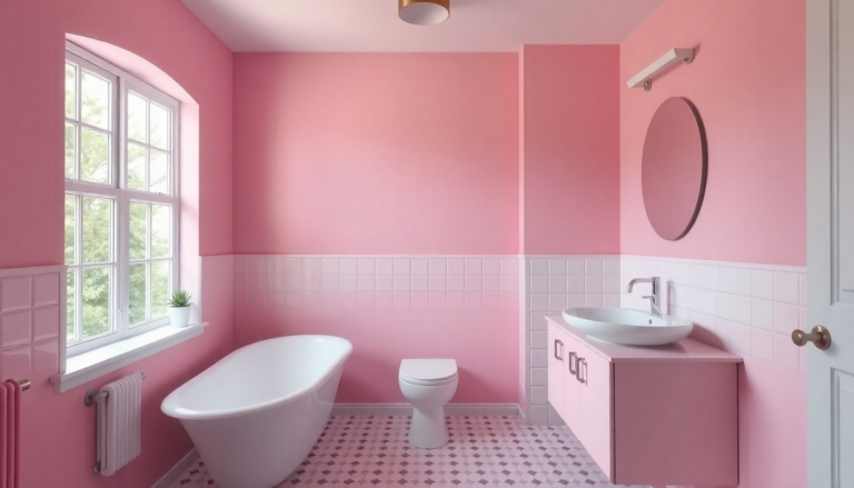
20. Light Blush Pink and Gold
Blush pink with subtle gold accents creates a feminine yet refined space.
This color palette brings warmth and sophistication, making it perfect for bedrooms, living rooms, and even home offices.
21. Midnight Black and White
For a more dramatic yet timeless feel, midnight black and white never disappoint.
Whether in walls, furniture, or accessories, this palette provides the ultimate high contrast, creating a sophisticated atmosphere.
22. Warm Taupe and Green
Warm taupe paired with green creates a harmonious, nature-inspired palette that promotes relaxation.
Whether you choose light sage or deep forest green, this combination works well in living rooms, bedrooms, or even home offices.
23. Gold and Charcoal Gray
If you’re after luxury with a modern twist, gold and charcoal gray are the perfect pairing.
The rich, warm gold adds a sense of opulence, while the dark gray grounds the space in sophistication.
24. Soft Gray and Yellow
For a cheerful, calming feel, pair soft gray with a pop of yellow.
This combo brings a sense of balance, with the gray providing a calm foundation and the yellow adding a burst of energy.
25. Rustic Red and Natural Wood
Rustic red paired with natural wood accents brings warmth, character, and a cozy feel to your space.
Ideal for kitchens or living rooms, this palette offers both vibrancy and comfort.
26. Blush Pink and Sage Green
For a soft and romantic vibe, pair blush pink with sage green.
This palette creates a perfect balance of lightness and serenity, ideal for bedrooms or living rooms.
Choosing the right color palette is not just about aesthetics—it’s about creating a space that makes you feel comfortable and inspired.
Whether you prefer soothing neutrals or bold contrasts, there’s a perfect combination waiting to elevate your home.
So, take your time, trust your instincts, and start transforming your space with the power of color!